What me!? Steal?

Without the ability to use images that are out on the web, my students and I would be sunk. It isn’t very fun to read a description about a work of art, when a photo of the work could say so much more. I truly believe that Fair Use covers us.  In fact, because we are discussing works of art, sometimes by living artists, in a positive light, we are actually doing them a favor.  We are giving them free scholarly press.

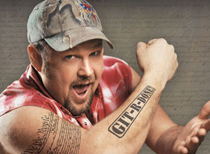
Take for example, my use of an image of Larry the Cable Guy. (Wouldn’t you like to see his image again right about now?) He’s popular in some low-brow circles, but among those who are educated, and over 40, his humor might be unknown.  I’m not making a profit off of his image, and in fact I might even be promoting him for free.

An article dated April 7, 2013 on NPR News discussed the record breaking online “stealing” of HBO’s wildly successful series – Game of Thrones. (I could insert a photo of Sean Bean playing Ned Stark here, but it is so much better if I just talk about it – right?)  It was the most stolen show of 2012.  Nobody believes that this form of online sharing is covered by Fair Use.  However, one of the show’s directors was quoted in the article, saying:

“No, it’s great. It really helps the show’s cultural buzz, and it does not impact the bottom line because HBO has more than enough money to keep making the show.”

It is true that artists have been harmed by internet practices.  Native American artist Lisa Fifield discovered that someone had reproduced images of her works on gift card.  (I’ve got your curiosity now, wouldn’t you like to see one of her paintings?) Now that’s stealing. As a result she has limited her internet exposure so much, that about the only place you can find her on the web is in old blogs by my students. This is truly a shame.  She’s an amazing artist, and I’m sure she could benefit from some cultural buzz.

fifield_murderofcrows1

Lisa Fifield, “A Murder of Crows”


JQuery Fail – sort of

I had no problem creating an accordion style tab using the source code given by JQuery.  Bam! It worked perfectly and was a total breeze. It made perfect sense to me, I was able to utilize this effect without a hitch in no time at all.

Creating the same accordion style tab by downloading the files from JQuery onto my server didn’t work.  I tried several variations of placing the file and writing the link. I tried downloading the whole library. I tried downloading just that script. Nothing worked.

Given the time constrains that I currently have, along with the stress of juggling too many balls in the air; I called it quits.  I am happy with what I was able to do.

I recognize that the downside of using the link to JQuery’s library rather than having it housed on the server along with my website means a slower load time for my webpage. The upside is that the link will always be to the latest version of the script and I won’t have to update my files.

Website Organization

The English designer William Morris‘  philosophy of design informs so many of my intellectual aesthetic decisions in life.  He believed that art should meet the needs of society and that there should be no distinction between form and function.

384px-Morris_Little_Flower_carpet_design_detail

William Morris, English, watercolor design for a carpet medallion, 1800’s.

Intellectually I am completely in line with this philosophy.  I think beauty and function should hold equal value. Function is a major component of organization, therefore, organization and beauty go hand in hand when considering website design. Beautiful organization and aesthetic beauty are one in the same and have equal value.

Who am I kidding!?  In real life I rarely manage to achieve such a balance.  I have a pretty long list of less than successful attempts that prove that my intellectual life and practical life don’t often meet.  Ack!  Just look at my office.

When I reflect on these attempts at beauty and functionality they are mostly due to constraints of time, lack of skill, appropriate tools and materials, and an insufficient dose of patience.  Lacking the obsessive compulsive perfectionism that has hit some of my family members, I am able to comfortably operate with organized chaos. My style of filing is best described as “enlightened piles.”  Practically, Larry the Cable Guy more accurately describes my philosophy of the real world: “Git ‘er done!”

larry

So when considering my quest to create a useful and beautiful scholarly website, I’m going to have to fuse my practical and intellectual philosophies.

20th Century author, Anis Nin once said:

“Life is a process of becoming, a combination of states we have to go through. Where people fail is that they wish to elect a state and remain in it. This is a kind of death.”

The philosophy I’m going to adopt for website creation is “process over product.” I’m going to put together a website, and it will be “okay.” It might not be as totally beautiful and functional as I would like it to be, but it will be a start. I have a particular design in mind, but when I put it together, I will most likely have to tweak or even trash that vision. Kinda like knitting.  Sometimes you can do small revisions and get what you want.  Other times, it is better to un-knit.

Beside, the way things are changing, HTML5 will be a dinosaur in 4 years.  Buzz Lightyear might have said it best:

“To infinity …..and beyond!”

Considering an Online Textbook

Back in January I wrote:

“I really enjoy writing and I have found that what I enjoy writing the most is non-fiction.  I have also found that I really don’t appreciate most text books.  The storage and clutter is enough to drive you mad.

I have been entertaining thoughts of a totally online textbook. I currently have an informative blog – and it’s “okay.”  I do find it limiting.  If I were to pursue a project for this course, it would be setting up a structure for an online textbook.  I find that most e-books don’t offer enough navigation features, so my most pressing interest would be setting up the initial structure for a website that would allow the user to easily navigate from chapter to chapter at will. Then, within each chapter, the reader can easily view sub-topics.

Some learners want to engage in material in a linear fashion, but even the most linear learner needs to be able to refer back to information.  Sure, search functions help, but sometimes the new learner’s grasp of information is so ephemeral that even a search function can fail to lead them to information they want to retrieve.  So I am very interested in structure.  If I had a structure that I liked, then I think I could be up and running to make it visually appealing as well as engaging in content.”

In considering this project, I am still all about structure and functionality, although stunning beauty is also a consideration and probably harder to achieve.

I need to design 3 pages:

  • Home page
  • Chapter page
  • Section page

HOME PAGE

I have decided that I am a less is more person. My original masthead isn’t going to cut it.  Too busy. I want a home page that is strikingly beautiful, featuring chapter buttons in a 3 column setting with a thin strip of navigation on the bottom (about, contact, fair use, etc.).  I’d like it to have a liquid layout. Fill up that screen baby!

CHAPTER PAGE

This would feature a thin navigation strip on the right with buttons to take you back to the home page as well as links within the chapter.  I was really impressed with Boundless and their online texts (https://www.boundless.com/#courses/Art-History/1/1).  They have feature on the top of the chapter pages that shows how much of the chapter has been read.  I like that!

SECTION PAGE

Just like the chapter page, each section needs the same thin sidebar on the left.  The fixed top navigation bar would indicate what chapter they were in with a link back to the main chapter navigation page, a site specific search function as well as a pull down menu that shows the sections within the chapter. The bottom fixed navigation bar would  contain navigation to the next section or back to the previous section. I like the idea of having floating elements for quotes  and possibly images – maybe?

The general guiding principle for my third pages will be a textbook sensibility.  You want enough white space around the text, nice borders around inserted videos, sliderockets, images, and maps. It should feel like you are reading a gorgeous, illustrated book on Kindle with extra navigation features that make a textbook a valuable resource.


White Space, Gradient Shadows, and Mystery

It would stand to reason that company in the design business would have a drop dead gorgeous website too.  Seymourpowell’s website is stunning.

So what makes it so stunning?  As I work on website design, what can I learn from a beautiful site like this? What can I incorporate in my own website?

What catches my eye at first is the clean, orderly use of white space. Almost 20% of the page is white space. Additionally each of the photos utilized in this page feature a product that contains a fair amount of white space with a unifying gradient shadow of dove gray along the edges. Even the sidebar features a shadow, giving a feeling of depth and more spaciousness.  This site gives the eye a chance to breath. There is restfulness, and elegance.

However, this rest and elegance is not complacent and ordinary. Those clever web designers. They included transparent sliders that transform each photo. Awesome!  But they are more than just a brainy parlor trick.  They add to the mystery that is inherent on this page.

Coming to this page without any previous knowledge of what the site was about, I see some interesting, but seemingly unrelated objects in each photo.  Hmmm?  What does this mean?  Then as the cursor hovers over a photo that I don’t understand, a slider appears stating: Coming Together, Durex, Play.  Well what the heck is that?  Even more mystery.  You got my curiosity now.  I must click. I must read the next page.

What-ho!?  I discover that this is an award winning design for a vibrating sex toy.  Who knew?

Online Surveys

I created a survey on Jot form!

logoIn the past I have used Survey Monkey to create a survey.

logged-out-logo

For the purposes of a survey – I found Survey Monkey much easier to use. No big surprise there.  Using their templates I found more resources to customize my survey and tweak it to get meaningful responses than what I was able to discover on my initial experience on Jot Form.

But Survey Monkey just does surveys.  On Jot Form I found so many templates that were immensely useable for a wide variety of applications. In addition to many forms which allowed the user to input their name, address, etc. There were forms that allowed folks to upload a file, check preferences, and select from pull down menus.  Additionally they offered background and colored graphics.  Pretty slick.

At this point in time, I’m not sure how useful Jot Form is for me.  Certainly if I were looking to sell something, or register people to collect marketing information or create an event web page- Jot Form would be great.  If I just wanted to know what people were thinking (as I have in the past), Survey Monkey is the way to go.

I’d invite you to take my survey – BUT… apparently that’s not something you can do in WordPress.  Here is what Jot Forms had to say about it as of June 2012:

“Unfortunately, adding forms to WordPress.com is not possible since WordPress.com does not allow 3rd party forms, javascripts or iframes.

Furthermore, there is no FTP access to free hosted WordPress.COM blogs and you cannot install individual plugins or third party themes into them. http://en.support.wordpress.com/com-vs-org/

Hope this clarifies a bit. Let us know if you have any further questions. Thank you so much!”

If you’d like to take my quiz, please copy and paste this link into your browser:  http://form.jotform.us/form/30557258729161

How clunky is that?

Tinker with Themes

Changing a theme on a WordPress blog is just about as easy as changing your underwear and takes about the same amount of time.

WordPress has an “Appearance” tool on the left hand side bar when you are in editing mode.  In that tool box is a selection for “Themes” and from there you have an ever expanding selection of free themes to choose from.

This is what my blog looked like a few minutes ago.

This is what my blog looked like a few minutes ago.

I switched mine from “Academia” to “Dawn to Dusk” with a few clicks.  I love their preview function.  I also found a menu which allowed me to change from the pre-set, self promoting sub-header to a sub-header that I created.

I also utilized the “Appearance” tool and changed my header as well.  I downloaded Albert Joseph Moore’s Dreamers from Wikimedia Commons, blurred it a bit and cut it in half using the open source image manipulation program – Gimp.  WordPress had an automatic size function that did the rest of the cropping.

This is how it looks now.  I think I like this better.

This is how it looks now. I think I like this better.

Tah-dah!  Day and night difference and it was that easy.

My Experience with Open Source Software

Incredibly Useful Open Source Software

I use Audacity in conjunction with LAME MP3 encoder all the time – almost daily.  It is open source software.  It is totally free and it is also advertisement free. Additionally, it does not load any undesirable add-ons to your computer, as I have experienced with some “free” downloads.

Audacity

Audacity is a multi-track sound studio.  It gives you the power to turn your computer into a mini recording studio. You can record sound effects, digital and acoustic instruments, and most importantly – your voice. It has got a ton of editing features, which I barely touch. I use it simply as a way to record lectures and instructions, and I use that recording in its raw form.

The LAME MP3 encoder works directly with Audacity, so once I am done recording, I can seamlessly convert my recording to an MP3 and then put those recordings into Blackboard or one of my blogs. I’d give you a direct example here, but WordPress won’t allow you to upload MP3s unless you pay for a storage upgrade (which I’m not doing for this blog). You’ll have to Click Here for a sample of a lecture recorded with Audacity. Simply click on any “play button” in the orange boxes.

Audacity works wonderfully with some other web applications that I have used, like Slide Rocket. If you want to add audio files through Slide Rocket’s recording feature, you have to pay money.  With Audacity and LAME, I can do it for free.  Here’s an example of a slide presentation I created using Audacity and Slide Rocket:

Reinvention of Rome Lecture

slide rocket photo

Yes, I could use more of the Audacity features and clean up my lectures, taking out the little pops and smooth it out.  But, I’ve been lazy and have justified my laziness.  I figure if I were giving a lecture live, it would also be flawed with “ums” and other verbal hiccups.

How could you use Audacity?  Let’s say you’d really like to convey a problem you had with an assignment to your instructor on Blackboard.  Rather than taking the time to laboriously type out what you’d like to say, you could simply speak it into Audacity, convert it to an MP3 and using the audio upload feature for comments through Blackboard. You could let your instructor hear your thoughts in audio form.

Is This Useful Open Source Software?

In my search for new open source applications, I stumbled across Notepad++. It is a source code editor like Notepad on my Windows OS, but it claims that it turbo-charges the speed of what you put up on the web, making sites load faster, and thus reducing carbon emissions, because presumably your computer won’t be on as much.

notepad++

Notepad++ claims to have PCRE (Perl Compatible Regular Expression) Search/Replace and syntax folding.  Wow!  So I guess when I know what that is, I will most assuredly want that.  I do believe I will download this application and try it as a text editor and see if it offers me any immediate advantage over using regular Notepad with no pluses.

Blogs vs. Websites

Blogs are dead common. Just about anybody can create a blog. I have 3 blogs myself.  That’s why I want to get above the fray and create a website.

Here’s what I mean about “fray.” Take http://cdixon.posterous.com/my-personal-bloggingtweeting-rules blog post as an example.

Image

Apparently he doesn’t know how to utilize the shift key on the keyboard, or he failed all his English classes in high school. Well, that may be a bit harsh, but this is an example of the informal cacophony that can be found on blogs. Additionally, this blog assumes quite a bit of previous knowledge.  What is a “start up?” What has this author stated previously?  No examples are given, just stream of consciousness writing. No need to educate; this is a look inside C. Dixon’s mind. Take it or leave it.

I am looking to get out of the “fray” and create an authoritative, instructional website.  No one would take me seriously as an authority figure if I didn’t have careful proof-reading.  There are plenty of blogs you can go to if you want to be assaulted with bad spelling, awkward sentences and unsubstantiated opinions. True, you can find websites that also have grammar problems too.  However, I would contend that we don’t expect those types of errors from a website, but we tolerate them in blogs. Here’s an example of a fabulous website that communicates with authority: http://smarthistory.khanacademy.org/.  It is not stream of consciousness, it contains many navigation points.  Smarthistory looks and feels educational.  While it might be very fun to explore this website; fun is not the major objective.

Image

A blog suggest a personal journey. Websites suggest a more factual presentation.  For example:  One of my favorite blogs is “Oh How She Glows”  http://ohsheglows.com/

Image

The author, Lauren, includes great navigation tools and has her own domain name.  Obviously this blog has some professional touches, but it still comes across as a blog.  It looks like a blog, it feels like a blog. And it is in fact a WordPress blog with a domain address. The voice and tone of her writing is deeply personal, although it is professional and informative. But because it is a blog, I only expect it to be one person’s perspective. Contrast that with http://www.katyperry.com.

Image

You might think this is personal too. But I contend that it is not. This website is designed to promote Katy Perry – the product, not the person.  This is evidenced by the factual, objective tone.  You want to see what is on Katy’s mind – you look at her Twitter feed.  The videos shown are her professionally released videos.  The store is a real website commerce space. The images are stunning without a whiff of amateur quality. The news feed is in blog format, but it is so factual and objective that nobody is even commenting on the news stories. It is clear that this is not an open discussion or a personal platform.  This website is all about the commercial side of Katy Perry. She’s not going to respond to your comments.

I feel that if my web presence is going to grow, I need to have a bon a fide, objective, educational website.  Blogs are great, I might want to continue to explore their use, but I feel I need to make a change and go for a website.

Websites – An Analysis

What makes a good website?  For me it is a combination of aesthetics and function.

Let me present 4 websites that I really admire, some I admire for their aesthetics and others their function and one I admire for both.

The Daily Mile

A look inside The Daily Mile

A look inside The Daily Mile

The Daily Mile is a free subscription site, which means you can’t see what I see, unless you subscribe. I use this site…..daily, or just about. The Daily Mile is where I log/journal my fitness training.  Through my logs it creates charts to visually represent my progress:  speed, distance, heart rate.  It even keeps track of my gear, so I know when to swap out shoes due to mileage wear and tear that might not be visible.  Yes, I am a fitness geek, or is it athgeek? Best of all it is a social network for other athgeeks like myself.  We cheer each other on, share training tips, photos, race events, triumphs and defeats. Through the “Community” feature you can find others with your interests, and join virtual challenges.

The Daily Mile features a user friendly structure with essential functionality. What I appreciate the tabs along the top header.  Through those tabs I can quickly navigate to my main pages of “My Daily Mile” to get to the essential information I need.  I reminds me of the tabs on a web browser; creating a sense of familiarity and ease of navigation. Additionally there are side menus that allow me to link to other resources, as well as a built in RSS feed which keeps track of all my other athlete buddies at a glance. Facebook developers should really study this site.  It makes so much more sense, but it probably doesn’t generate as much income.

Runner’s World

Runner's World

I use the Runner’s World site as a resource.  Again, like the Daily Mile the tabs across the top are easy to use, even if they aren’t formatted to look like folder tabs.  The home page is updated monthly with new articles, videos, news, and recipes.  Once I am in one of the sub-directories, they have links on the side to get me deeper into the topic.  The compelling compliment to the web design is great, cutting edge articles on a wide variety of subjects that I find interesting.  I spend way too much time poking around this website, which means I am exposed to a lot of targeted advertising.  They’ve got me by the wallet!

My Provence Festival 2013

My provence front

This is a tourist promotion website featuring an online “virtual” art competition focused on Provence, France. My Provence is aesthetically intriguing. It excites my imagination and makes me want to take a Photoshop class.  The stunning visuals on the front page were bold and enigmatic.  I wanted to know more. Once you get past the home page it gets even better.  There are floating buttons and images that transform when your mouse rolls over them.  It is so creative!  However, it is slightly flawed.  Once you get to the “grandchild” level of this English version of the website, everything is in French.  A beautiful website, but not totally 100% functional.

Nike

Nike front

I am not a shopper, but Nike’s website is just about enough to turn me into a blithering, spending idiot.  This site is beautifully appealing and has a ton of head turning web design features that suck you in.  Even the top tabs are special.  Just look.

nike tabs

When you select a tab from the top, they not only give you text, they give you dynamic photos too.  From there it gets even better. Model are presented in an outfit and with your mouse you can select the top or the bottom for further inspection. Roll over an apparel item and a tantalizing pop-up will appear proclaiming a technology feature of the item – like “Sphere Dry Thermal.”  Ya baby – I gotta have me some of that!!  I don’t don’t even know what that means, but it sounds good.

Nike’s web page is a winner.  Beautiful, creative and highly functional….well maybe not totally functional.  I haven’t bought anything there – yet!